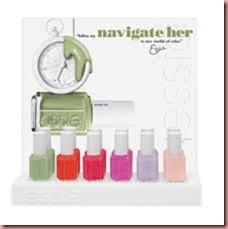
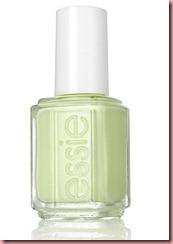
Navigate her, a pale pistachio green cream
This fabulous pistachio green is absolutely amazing!! I never saw a color like this before!! Creamy, smooth, refreshing, a dream!! This kind of color will escort spring and summer throw the seasons. And please don’t mix up pistachio with mint; they are similar but totally different. Pistachio is pale green with a yellow undertone; mint is pale green with a blue undertone. So you can imagine that pistachio will be the color for brunettes, bronzed and dark skin tones. Mint instead will look perfect on blondes with a blue undertone, maybe even on red headed.
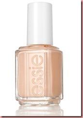
A crewed Interest, light peachy cream
Although pastel color belong to spring like a fish in the water, I always think that they are not so flattering on nails!! Don’t get me wrong, I love pastel but it’s so difficult to find the wright color matching your skin tone. They look all to “whitie". Or maybe is just me!
However this peachy rose cream looks way to light for my skin tone, it took my tree coats for good coverage and the result is ordinary. It may look better on blondes.
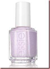
To buy or not to buy, pastel lavender shimmer
When you say lavender, you say Provence. I don’t get the meaning of the name here. What has lavender and finance alike? Whatever, this outstanding lavender has a fine blue shimmer to it that gives the color some dimension, but just from the first look I had strong déjà-vu feeling! And looking in my stash it came to me that Essie has already such shade, it’s the exactly same shade from last spring. “Nice in Nice” is twin to “To buy or not to buy”: only difference the fine micro shimmer.
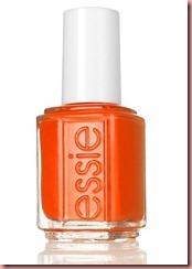
Orange, It’s Obvious, a saturated bright orange
Ok! If you follow my blog you will know that orange is one of my favorite color for nails, along with green of course. So it’s no surprise that this lovely bright orange blow my mind away. It’s a very heavy pigmented outstanding vivid orange. I don’t’ know if this shade is the appropriate color for the spring, it’s definitely the perfect color for the summer. I will wear it! Promise!
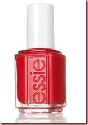
Olé caliente, bold red coral cream
This is indeed a hot color! Strong, bold, rich red hue with a coral hint to it and a bluish undertone. The ideal color for blondes and redheads. I needed two coats for full coverage and the cream finish is luminous and glossy. But again it remained my of a shade I already seen. In fact “Too Too Hot” from last summer looks just the same, maybe a hint darker, that’s the only difference.
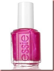
Tour de Finance, a vivid shimmery fuchsia
Vivid, shocking pink, the kind of pink that you can see on hot shoes and hot pants. A very nice fuchsia…. but… again something familiar: Super Bossa Nova of the Brazilian collection from last summer looks almost the same, the only difference: Super Bossa Nova has bigger shimmer sparkle to it.
Opacity and Texture:
The lighter lacquers were a bit runny and I needed tree coats for a good opacity. Even for coat for the lavender. The bold colors are amazing on the whole line. They are very heavily pigmented, smooth in the application, have a great glossy finishing, and needed only two coats. They are great.
The bottom line:
Although this collection has couple of jewels, I am still disappointed of Essie. Come on!! Tree almost identic shades as last year collections! You may think we will not find out! What’s the matter with you?! I always admired the fact that Essie was innovative and up to date, but I have to overhaul this.
The fact that so many doublets are around this year and that Essie launched some of them, doesn’t make it easy to finish this article in a positive way. I am desperately trying to find a nice end for this collection but I can’t get over this. Hope Essie will find her way out this “double-like-kind-of-lacquer” stage and be amazing again.
Nonetheless this collection is fun to wear. My favorites are off course “Navigate her” and “Orange, it’s obvious”, love the color, the texture and that pistachio is “the color to wear” for the warm season.
Launch: Essie will be launched in Switzerland on March 2012
…and remember, have always nice manicured hands, think pink and just stay gorgeous as you are!!
Please consider that the colors can differ from the reality depending on the resolution and calibration of you screen.
Spezialisiert auf die Bedüfniss natürliche Nägel. Specialized on natural Nails.
