I have decided to review this collection by color group and not in finish because there’s such an obvious difference between the bright, sun-kissed colors and the muted, neutral shades of the second part.
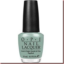
Thanks a WindMillion: pale muted green, creme
My first impulse when I saw this shade was to compare it with the other greens for the next season (specifically to Essie navigate her, Orly Jealous, much?). My first impression was that the previous ones were way prettier than this one, and my opinion hasn't changed. I love green on my nails but not so muted and washed out. I can recall the greens of last Brights (Stranger Tides, Mermaid’s Tears), well Thanks a WindMillion is a mix of these two shades. A disapontment.
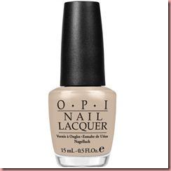
Did You’ear About Van Gogh?: nude beige, creme
When I think of Van Gogh the first thought that comes to mind is his ear. So I get the name of this shade, but beige?!? Whatever!! A very wearable, neutral, pale, nude beige with an amazing texture for such a light color. Love this one on my nails.
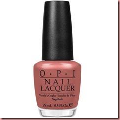
Goude Goude Two Shoes: light terracotta, shimmer
Gouda is a Dutch cheese, so I was expecting a yellow, creme, light color, but not with OPI. This light terracotta shade has a very fine gold-copper shimmer, again, a very wearable color, it looks fine on my nails wich have a blue-olive tone but can easily work on cool blue-red toned skin and also on yellow-red skin tone.
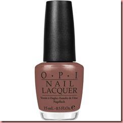
Wooden Shoe Like to Know: chocolate muted brown, shimmer
There’s something special in this chocolate-prune brown. Maybe it's the fantastic shimmer, a mix of copper-gold-green sparkles, or maybe it's because it's so pretty on my nails. I love browns and this one is perfect, and even though it's a hint too muted it’s still a vision.
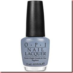
I Don’t Give a Rotterdam!: steel blue
In some OPI collections there’s 2 or 3 colors that look the same but are not. Remember The Swiss Collection: I’m Suzi & I’m a Chocoholic and From A to Z-urich! Or The Texas Collection: Guy meets gal-veston and Big Hair…Big nails!, or in the South Beach Collection (my favorite by the way): OPI on Collins Ave and Paint my Moji-toes Red? In all these cases the shades look the same but aren't. I can’t help but wonder why they do that? My personal theory: one shade is for the blue skin toned girl, the other for the yellow skin toned girl. Someday I'll have to ask this question to Suzi Weiss-Fleischmann!
Back on topic! This steel blue, almost grey color has a very subtle gold-silver-celeste shimmer. For a full coverage you may need 3-4 coats and in my opinion this is best suited to cool skin tones.
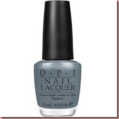
I have a Herring Problem: shimmer green-blue
If “I Don’t give a Rotterdam!” is meant to be for cool skin tones, I have a Herring Problem is the warm skin tone shade. From the blues in this collection this is definitively my favorite. It has a hint of green to it but still has its sister's gorgeous shimmer.
Opacity and Texture:
The neutrals in this collection are really worth the money. They all have a wonderful texture that glides smoothly on the nail like a skate on ice. The 2 cremes have a perfect texture for such light color and a great opacity, a 2-coater with perfect coverage. The shimmers are smooth as well, the fine shimmer leaves a crisp, super glossy finish.
The bottom line:
This second part of the Holland collection is as good as the first one. Love this neutral beige, the very subtle light terracotta, the blues (even if they are very similar). I am a little disappointed with the green, I expected a real bright pistachio green, instead of a muted-grey green that leaves me with a strong déja-vu feeling. On the other hand I am surprised to see that all the shades in this collection are highly wearable. The nudes are neutral, elegant, timeless. Again very well done.
Launch: Official Launch in Switzerland is February 15th
…and remember, always have nicely manicured hands, think pink and just stay gorgeous as you are!!
Please beware that the colors in the pictures can differ from the actual color depending on the resolution and calibration of your screen.
Spezialisiert auf die Bedüfniss natürliche Nägel. Specialized on natural Nails.
